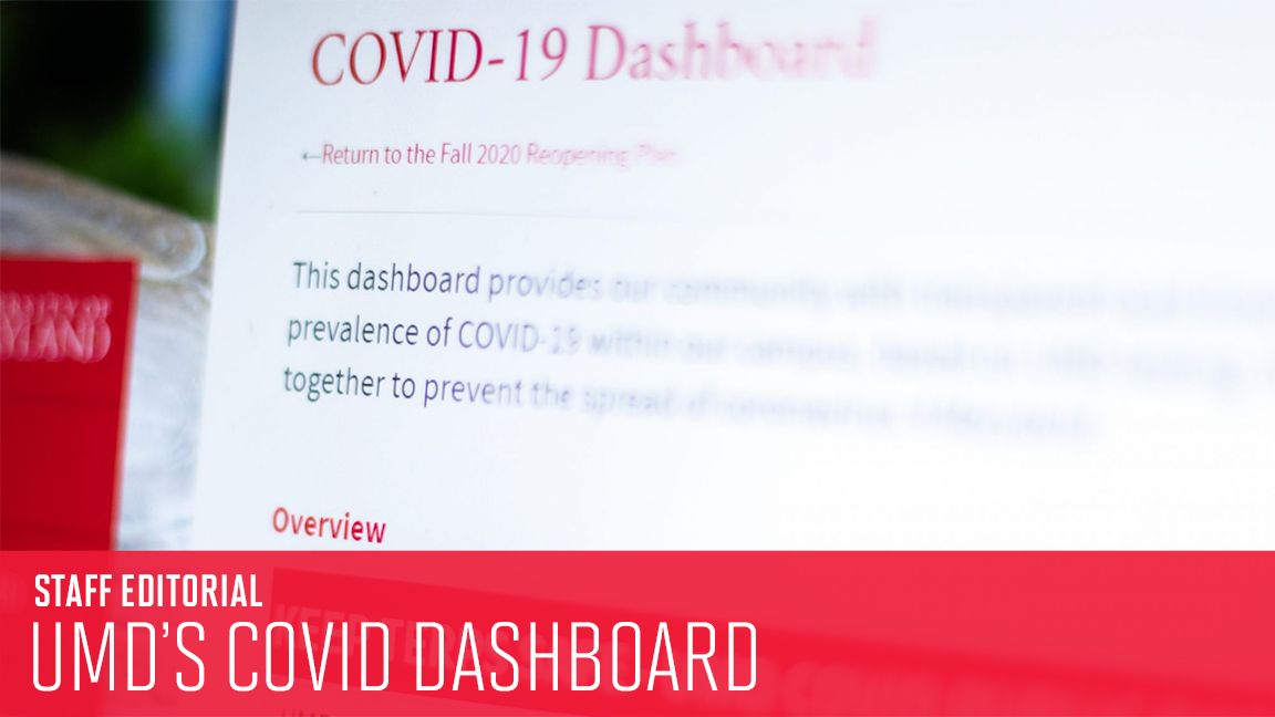
One of the shared governance principles the University of Maryland is using to guide its ill-fated quest to reopen campus is, simply, transparency about “the effects of COVID-19 on our campus community.” And the university has repeatedly pointed to its COVID-19 dashboard as a shining example of transparency.
But, instead of giving the community clear and accessible numbers, the dashboard is full of mysteriously disappearing data and arbitrary categorizations. The university is using the dashboard to paint an inaccurate picture of COVID-19’s presence in College Park, downplaying the very real toll the virus is taking on our community.
Right now, the dashboard claims — in big, bold lettering — “New Cases Week of 8/30/2020 – 9/5/2020: 85.” But that’s not the whole story. When you read the fine print, you see there are actually 100 more “unverified” cases, self-reported by people who have been on or near the campus in the last two weeks. So it’s not 85 new cases. It’s 185.
The university’s separation of university-administered positives and self-reported positives is a dangerous, self-serving categorization, put in place only to make the virus’ spread look less extensive than it is. And labeling these self-reports as “unverified” is a laughable attempt at undermining the validity of self-reporting. Community members are not fabricating positive COVID-19 cases. The university has proved — in its failed attempt to show that it’s cracking down on unsafe behaviors — that reporting positive tests could actually result in more sanctions than keeping it to yourself.
Plus, the implication that other testing centers are any less trustworthy than the university’s — which has mistakenly communicated incorrect results to 14 students — is absurd. And off-campus testing was the only option for many students, as the university didn’t have the resources to test everyone who wanted or needed to be tested. Their results shouldn’t be discounted because the university failed them.
And let’s not forget, there is no more mass on-campus testing until Sept. 15. Does this mean the university will simply report zero new cases for the week of Sept. 6, with the inevitable hundreds of self-reported cases disclosed in the fine print? This separation of on-campus and self-reported positives is an inexcusably inaccurate representation of the current situation, with a stupidly easy fix.
The university — or at least someone at the university — knows this. For a brief period early Sunday morning, the two statistics were presented in sum. But by 2 p.m. the same day, they had been separated, in an obvious attempt to spin the dire situation into something a little less dire
That kind of change isn’t out of the ordinary for the dashboard. The metrics the university chooses to display have changed repeatedly, and data are mysteriously and inconsistently updated, sometimes changing twice or three times before they settle into their final form.
Just this week, the numbers detailing quarantine/isolation housing capacity dropped dramatically, initially with no explanation. For example, on Saturday, the dashboard showed Thursday’s on-campus quarantine/isolation total capacity as 300, with 64 spaces occupied. By Monday, Thursday’s total capacity had been changed to 109, with 32 spaces occupied.
By Monday evening, the university had provided a clarifying note at the bottom of the site: “The quarantine and isolation housing data has been adjusted from a per-bed basis to a per-room basis to more accurately reflect how space is allocated.” But, really, what does that mean? Why was using the number of beds inaccurate? Is the university still able to house the same number of students? Are quarantined students sharing rooms? How exactly is space allocated? Transparency is telling us what’s going on, not making us guess.
Providing the university community with a half-baked dashboard is not transparency — it’s PR damage control. In this uncertain time, information is key to staying safe. And this university is preventing its community from doing that.