Views expressed in opinion columns are the author’s own.
Knowing that I’m writing a column about the Iribe Center, someone who’s read several of my columns (hi, Mom!) might groan, “Oh God, I know exactly what’s coming.” They would probably expect me to recount the center’s origin story — Oculus founder Iribe had the idea on a golf cart driven by this university’s computer science chair — and lament that our priorities are set by the momentary whims of billionaires.
They’d likely assume I would point out how there aren’t billionaires waiting in the wings to fund a counseling center expansion or fully staff the Office of Civil Rights and Sexual Misconduct, and insist that higher education is a public good, one that cries out for significant increases in state funding. Neoliberalism, bad philanthropy, etc., etc.: my usual hobby horses.
All that is right. But I want to make a far less substantial critique of this new project: The Iribe Center makes me sad when I look at it. So many of the new buildings around the campus make me sad when I look at them — I’ve long held a personal vendetta against The Hotel at the University of Maryland — and I know I’m not alone.
Some might be wary of accepting an aesthetic judgement from a writer who has no background in architecture and is currently wearing a Red Sox sweatshirt, khakis and neon green socks. But I don’t think these giant buildings are meant to appeal only to trained architects; they’re meant to be enjoyed by students, faculty and staff. Whatever your training, buildings shouldn’t make you feel cold, lonely or scared. So I offer nothing more than an amateur’s take, earnestly exploring why I can’t stop thinking that mean robots will storm out of the Iribe Center and destroy everything I love.
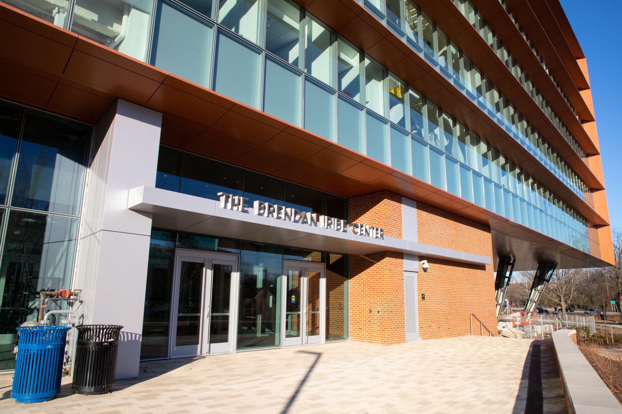
One of the big problems with the building is that it’s scary. From the outside, you see a massive, imposing wall of glass with horizontal, pointy-looking protrusions. It looks like where all the coders would work in a movie where 99 percent of human jobs have been automated. The strangest feature is that a large section of the building is lifted above the ground, held up by stilts, so that students can sit or stand underneath. Why anyone would enjoy standing underneath a huge, presumably very heavy glass structure is beyond me.
And I can usually appreciate different architectural features, even some that have no functional purpose! Intricate carvings, interesting color patterns, spires, even gargoyles — all of these things are simply pretty and provide joy. My old dorm, Anne Arundel Hall, has a cupola on its roof, and I’d often walk by and think, “How cute that there’s a cupola up there.” When I see the Iribe Center, I think, “I sure hope that building never crushes me while I’m walking to class.”
The building is asymmetrical of course, because in much of modern architecture, symmetry is for sellouts. This means “selling out” to what people actually enjoy and find beautiful. Inside, there are a lot of greys and whites, high ceilings and a ton of glass. Aside from some serotonin-replenishing plants — and a lovely rooftop garden! — the whole thing is quite sterile.
All the glass is presumably inspired by the Silicon Valley design goal of making sure your boss can observe you at all times. And the fact that much of the building is transparent provides a playful commentary on a university that is anything but. My colleague Hadron Chaudhary put it beautifully over Slack, writing, “umd builds all these glass buildings but doesn’t really want anyone to see what’s inside…..”
Brianna Rennix and Nathan Robinson at Current Affairs once proposed a quick and dirty method of judging architecture: imagine what the building would sound like if it could speak. Would the words of Shakespeare flow forth, or would it make a sound like “blorp”? Sadly, the Iribe Center, and many of this university’s other recent constructions, are blorp buildings.
Perhaps it’s inevitable. Many of the works of architecture we find most beautiful are monuments to God or to the nation — or at least dedicated to some altruistic public purpose. Instead, The Iribe Center is a monument to “innovation.” Iribe himself says, “I want the Iribe Center to feel like Silicon Valley just hit College Park.” A promotional video describes the building as “215,000 square feet of pure innovation.” Even the bathrooms — innovation! Sadly, it turns out a building that’s pure innovation can’t say much more than “blorp.”
Max Foley-Keene is a junior government and politics major. He can be reached at maxfkcap2016@gmail.com.


