Luxury fashion house Givenchy launched a new social media campaign earlier this month, showcasing its spring/summer 2021 looks from designer Matthew M. Williams’ debut collection and presenting the new looks on various celebrities, influencers and models.
The brand’s promotional photos hyped up its audience, making people eagerly anticipate what would be a new era in its creative direction. Williams, the co-founder of techwear brand 1017 ALYX 9SM, was named creative director of Givenchy earlier this year, and the fashion world wanted to see what he would do.
But Givenchy’s promo photos were better than the real thing: Its new campaign is anything but exciting.
[Review: Netflix’s ‘Social Distance’ shows COVID-19 should stay out of entertainment]
Social media campaigns don’t have to look like typical magazine editorials — Balenciaga’s eccentric Instagram presence is a prime example. The Spanish brand’s strange posts have depth and catch the viewer’s eye. There’s a method to their social media madness. They use models, so it doesn’t feel forced compared to Givenchy’s mixture of mostly celebrities with a few models sprinkled in.
Most of Givenchy’s photos lack what makes any fashion shoot pop: quality and creativity. A decent amount of the photos look like they were taken on smartphones — or at least rendered to seem that way — and some are awkward or indecipherable.
Smartphone photos aren’t inherently inferior, but campaign photos shouldn’t look like they were taken on one even if they actually were. Some photos barely show the garments or are too far away for anyone to be able to decipher detail of the pieces. Few photos truly caught my attention — there’s even an entire Reddit thread discussing how “underwhelming” it was.
Kim Kardashian’s photo is her posing against a white wall, looking at the camera over her shoulder. There also seems to be a thick lock of hair on the floor, which takes away from the striking outfit she’s wearing.
View this post on Instagram
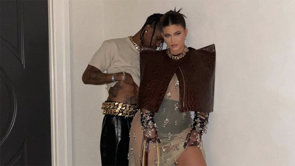
Kylie Jenner and Travis Scott’s photo looks more like a night out pic rather than part of a campaign showcasing clothing. There’s too much negative space, you can barely see the detail of Scott’s chunky chain belt or Jenner’s sheer dress, and the lighting is off. It’s messy, and not in a good way.
Models Bella Hadid and Ella Snyder are highlights of the campaign, bringing life and intrigue to the garments, almost making them come alive. This could probably be attributed to the fact that they are both models whose jobs are to do exactly that.
Actress Laura Dern also serves in her shoot. The environment around her is interesting and has texture, which separates her and the outfit from blending in with the background.
View this post on Instagram
[To quench your thirst for art during COVID-19, consider Studio A’s programs]
Maybe Givenchy wanted to connect with a younger audience and thought making an imperfect social media campaign would hit the mark. However, the end result was a mix of a few high-quality photos and mirror selfies that confused people. Many Instagram users commented on their aversion to the campaign under Givenchy’s posts.
Matthew M. Williams’ idea was good in itself, but its messy execution was its downfall. We know Williams is capable of better — ALYX is an innovative and interesting streetwear brand that shook up the late 2010s with its chest rigs and tactical belts.
Hopefully, Williams has more ideas up his sleeve that can innovate on how people see Givenchy. Until then, Balenciaga’s Instagram posts are where it’s at.


