Views expressed in opinion columns are the author’s own.
If you were blindfolded and dropped in a Taco Bell in the 1990s, you’d know it was a Taco Bell as soon as you removed your blindfold.
The bright purple, pink and teal accents on all the tables and chairs would have made it obvious. You wouldn’t confuse it with a McDonalds or Pizza Hut, which were covered in clown iconography and checkerboard patterns at the time. Each brand was distinctive; each had its own character and personality.
If you were to go to a Taco Bell today, you’d be met with sleek silver tables and ceramic tile floors accompanying subtly taco-themed art pieces. It all looks very modern, as does their new monochrome logo, but it looks the same as most other fast-food interiors. Motivated by a pressure to conform for the sake of maximizing profits, the company lost their character.
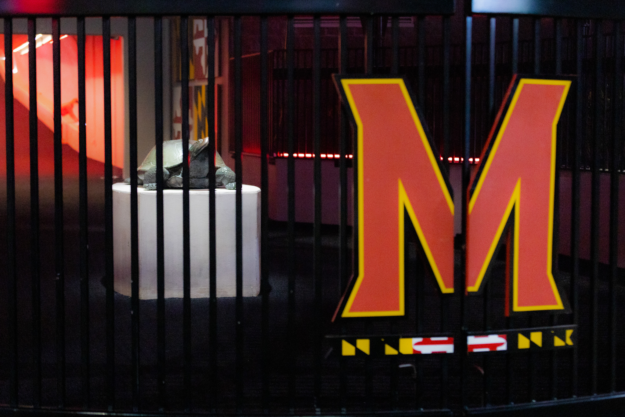
In case you skipped the headline, this column is not about Taco Bell. The same branding trend that stripped the restaurant chain of its color also came for our campus’ favorite turtle in 2012, replacing him with a block letter M underlined with a flag-patterned bar.
Over a decade later, our brand is due for a revitalization. We need our character back. We need Testudo more than ever.
But let’s start by looking on the bright side. The “M bar” was designed by branding professionals for a reason, so what did they prioritize in their redesign?
First of all, the logo just screams Maryland! From the colors to the weird little flag ribbon at the bottom, the state of Maryland is the only thing it represents. But some in the sports world still don’t appreciate this profound symbolism.
According to Sports Illustrated, our M bar is one of the worst logos in the Power 5. It fits in nicely with the other block letters at the bottom of the list, including the scarlet letter logo of fellow Big Ten afterthought Rutgers University.
Since announcing its move to the conference in 2012, the University of Maryland has worked tirelessly to convince the country that it belongs with the big, bland brands of the Big Ten. Still, one key fact has been overlooked in this rebrand.
We are not a company.
We are a university with people who have interacted with each other over centuries to form a culture. Over time, this culture led to the development of memories, traditions and symbols. The M bar was never one of those symbols, but Testudo was.
For most of the time between 1967 and 2012, the university’s athletic logo featured its mascot—Testudo, the diamondback terrapin. It made sense for the Terps to have a terp logo, and it looked good too. “Muscle Testudo,” specifically, is a highly detailed rendition that strikes a delicate balance between aggressive and friendly. It’s a dichotomy fans know well.
“Muscle Testudo” is not the sleekest or cleanest logo in the conference by any means. After all, he’s “an Arnold Schwarzenegger among reptiles,” according to former Diamondback reporter Kevin Rector.
What he does have, however, is personality. Look in his eye. There’s a soul in there somewhere. Now look at the M bar and tell me how it represents us. If the university wants to reclaim its own personality, it needs to scrap the brand-friendly minimalism and return to the turtle.
This turtle has become a unifying symbol through national championships in football and basketball over the past half century. To this day, it remains ingrained in the minds of alumni as a staple of their formative years, and is more than a logo to us.
Bringing back this symbol would remind the community that the university cares about the history they’ve created. It would tie the modern era of Maryland athletics back to its legacy, giving athletes and fans a renewed sense of pride in their teams.
It would show the conference and the county that we’re not afraid to show our true character.
It would give alumni a reason to come back to campus and buy new merchandise, directly supporting the university. In fact, we’re already seeing returns on this turtle’s resurgence.
This week, the university’s football team announced that they’d be switching their uniforms back to the “Script Terps” look that carried them through their glory days.
The turtle is slowly clawing its way back into the university’s iconography. Nostalgic fans will undoubtedly flock to purchase the throwbacks as jerseys and hoodies, thus proving the terrapin to be a profitable trademark, at least temporarily.
If you were blindfolded and dropped off at SECU Stadium today, you’d see a conventional football field surrounded by fans and occupied by players. You wouldn’t know where you were until you saw the human-sized turtle.
Maybe the university will once again embrace the culture and uniqueness they’ve spent two centuries building. Until then, its iconography is like Taco Bell’s: flavorless.
Joey Barke is a sophomore government and politics and journalism major. He can be reached at joey@terpmail.umd.edu