Large corporations have recently hopped on the trend of redesigning their logos in a minimalistic art style. In September, J.M. Smucker, best known for its jams and jellies, created a new minimalistic logo, but fans of the products were not pleased.
Smuckers isn’t the only corporation guilty of a minimalistic redesign. Companies such as MasterCard, Olive Garden, Airbnb and even Tropicana are just a few that’ve redesigned their logos and products, in some eyes ruining the original look.
Minimalistic logos have even become a meme across the internet, with someone jokingly redesigning the Doritos logo with a simple orange triangle on a red or blue bag.
[Criticism of ‘Drag Race All Stars 6’ cast highlights racism, exclusivity of fan base]
The commentary around the fake Doritos rebrand ranged from distaste to approval. After seeing this controversy unfold online, I asked myself: What if College Park and Maryland staples were redesigned in a minimalist fashion? Here are my four redesigns of iconic local logos.
Testudo
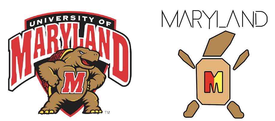
For minimalist Testudo, I decided to take a soulless approach to redesign our beloved mascot. I stripped away shading, detail and emotion from its face. I wanted to include yellow — one of this university’s colors — into the design, so I made the “M” on the center of the chest red and yellow.
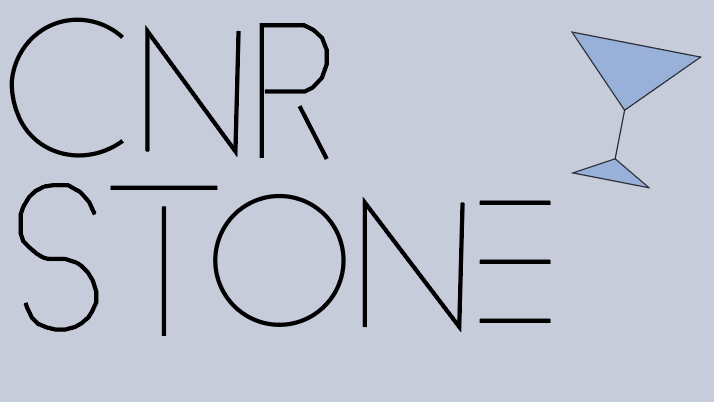
Cornerstone Grill and Loft
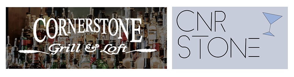
For my second redesign, I took a more modern approach. Since the design is simple to begin with, I wanted to make it even simpler. By giving the logo a sleek design with a gray color scheme, I made it more futuristic. Although the actual logo doesn’t include the liquor bottles, as the reference photo is a screenshot from the website, I still wanted to include that aspect in the new design.
Marathon Deli
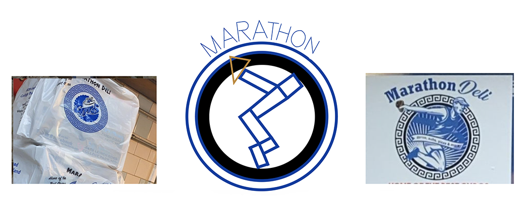
For this redesign, there wasn’t one conclusive logo, so I referenced these two images I found on the deli’s Instagram. For this design, I wanted to stay true to minimalism and really simplify the look. I took inspiration from both images with the man holding the gyro on the right and some extra elements of blue from the logo on the left. I took every element of it and made it minimal.
[Here are the best outdoor destinations in D.C. for a post-finals day trip]
The Maryland flag
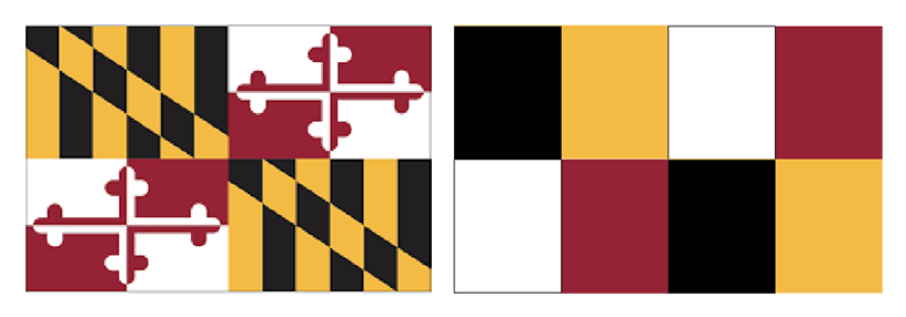
I think this one is cursed. This redesign really encapsulates the problem with minimalistic designs. It takes something loved and appreciated by people and makes it into nothing. This design feels blasphemous. There’s no real way to make the Maryland flag minimalistic since part of its allure is its print — besides blocking the colors.
Personally, I’m mixed on minimalism as a trend. There are times when I like the revamped logo and times when I don’t. I also don’t think every logo needs these smooth lines and simplistic colors. While I understand the need for these companies to feel modern, part of what makes a good company is a logo that’s instantly recognizable. Sometimes it’s best to just leave things untouched.