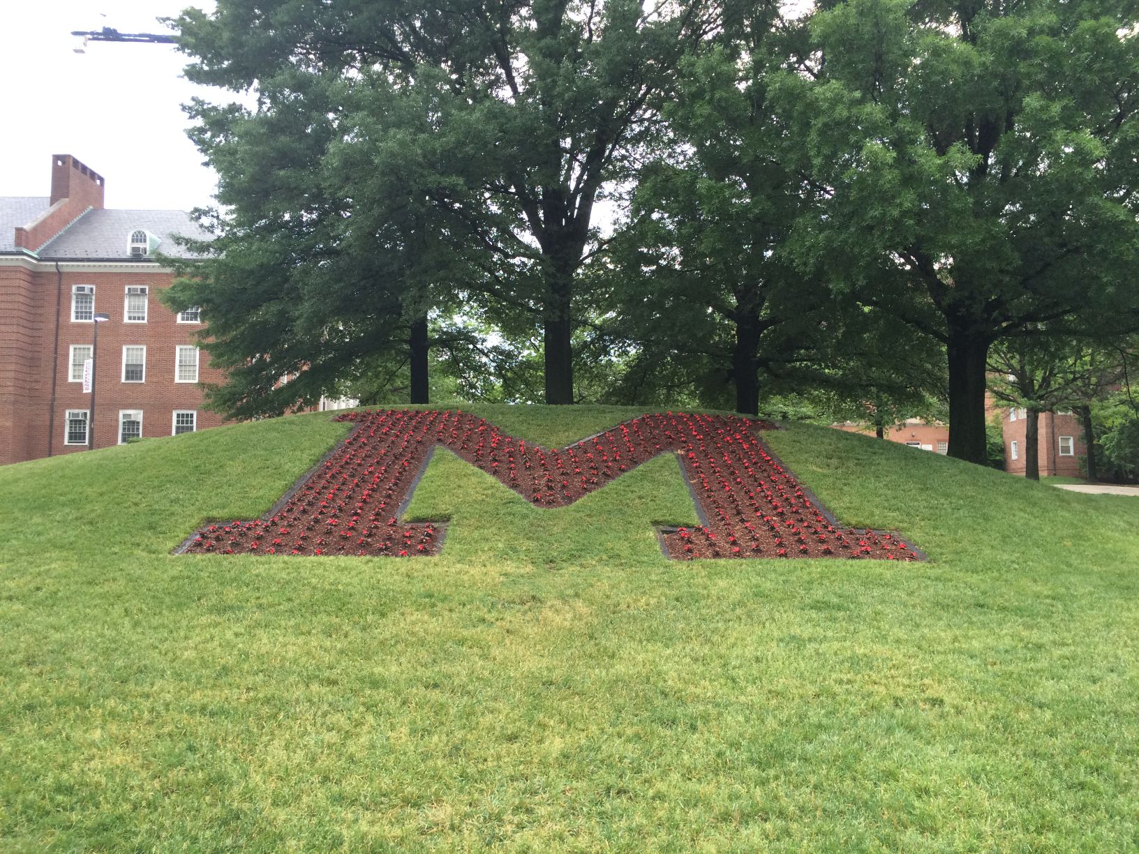
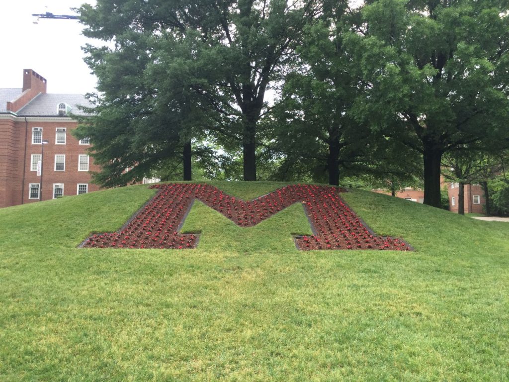
During the past few months, one of campus landmarks at the University of Maryland had been unintentionally paying homage to a conference rival. Luckily though, the problem (reading this post might require you to expand on your definition of what a problem is) has been fixed, and College Park students no longer feel like they go to school somewhere else.
The university’s giant “M,” located in the center of the circle at the intersection of Campus Drive and Regents Drive, had been planted with yellow pansies. But, wait — doesn’t that look familiar?
Are Maryland’s flower people confused? Do they think we’re in Ann Arbor? Why isn’t the ‘M’ red? WE ARE NOT MICHIGAN pic.twitter.com/duanbWmkM0
— Terps Watch (@TerpsWatch) May 11, 2015
Now, I found it a bit odd all semester that one of the most iconic campus symbols looked like a shrine to the Wolverines instead of the Terrapins, so I set out to find the person part of the decision making for these matters and voice my sentiment.
My search for a voice of authority on this topic delivered me the arboretum and horticultural services assistant director Karen Petroff. So I called her and asked whether other people have mentioned the unfortunate coincidence. I was glad to hear I wasn’t the only one.
“I would say I’ve certainly noticed that,” she told me. “And a few other people have mentioned that it was nice of us to put the University of Michigan’s logo in the middle of campus, too.”
Petroff did point out, though, that this was a problem that only recently began to matter. She told me that the current “M” was built in 1976, and at that time, Maryland was a member of the ACC.
But now that the school is in the Big Ten — why continue to use yellow flowers to fill in the M and accidentally show support for the maize and blue? It turns out, Petroff and her crew don’t really have a choice.
“The color of the ‘M’ is based on seasonality,” she said. “In the winter, there are very few seasonal plants that will also have some color. That is why yellow pansies have become a tradition.”
Interestingly enough, last Monday, the day after I sent out the above tweet, I was strolling down Campus Drive when I saw this taking place:

M reconstruction
As you can see, the grounds crew had removed the yellow pansies and was replacing them with red New Guinea impatiens (see how I just casually dropped that flower name like I knew what they were and didn’t just get the knowledge from Petroff?).
She said the change was again based off seasonality and, much to my chagrin, not because of my tweet.

M Circle
“Pansies like cooler weather and won’t perform well in the summer because it’s too hot, whereas New Guinea impatiens, which is what are in there right now, can’t tolerate temperatures below 45,” Petroff said. “So it’s all about the seasonality and what will perform best.”
Still determined to see whether I had any influence over the university’s floral decision making, I asked Petroff at the end of our phone call whether my investigation would lead to avoiding a yellow “M” in the future. She said no but did say something else that gave me some hope.
“There is currently a plan to move the ‘M’ at some point, and I would hope that the reincarnation of the ‘M’ would be that appropriately detailed signature ‘M’ for the university,” she said. “It’s all about the font.”
For now, though, with the red flowers about to bloom, the problem is solved right?
Wrong. Before hanging up, Petroff laughed.
“When it’s red, and you’re standing at the top, it actually looks like Wisconsin’s W,” she said.
Apparently there’s no escaping this issue. Anyone else want to scrap the “M” altogether and just put Testudo there instead?


