TERPS WATCH is The Diamondback’s sports blog, where we share fun stories about Maryland athletics. Follow us on Twitter at @TerpsWatch.
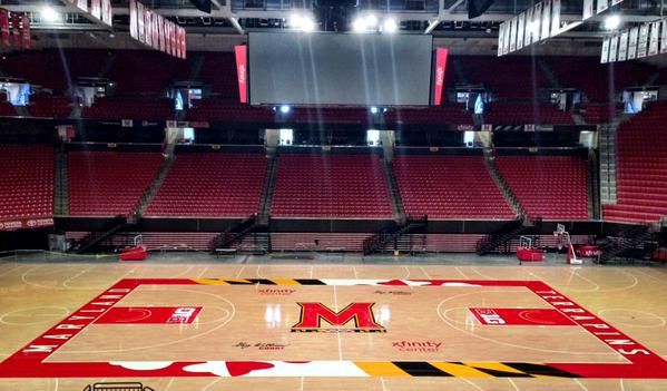
Last Friday, University Maryland Athletics released a 31-second video unveiling the new court design at Xfinity Center on Twitter.
Here’s the glorious piece of cinema in its entirety and a second-by-second breakdown of my thoughts as I watched.
Maryland Pride engrained in hardwood… Check out the NEW Gary Williams Court at XFINITY Center! #FearTheTurtle http://t.co/hnI1yZooSP
— Maryland Terrapins (@umterps) August 28, 2015
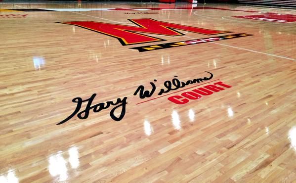
0:00-0:01 — Anytime I see Gary Williams’ name it feels like a lightning bolt of greatness has hit my eyeballs. A solid start — the only thing that would’ve been better is a clip of Testudo posterizing Coach K, but since that’s probably never happened, seeing Williams’ name written in stunning cursive will do just fine. That was possibly the best opening second to a Big Ten basketball court update video ever. A bold statement, but true.
0:01-0:06 — I’m a fan of the music choice. If I were running the show, I probably would’ve gone with a DJ Khaled-type track to really set the tone, but the people in charge of putting this promotion together clearly know what they’re doing. This song sounds like it’s building up to something special, and I can’t wait to get there.
0:07-0:14 — It’s all a tease now; we only get a glimpse of the new baseline here, a shot of the new sideline there. From what I can tell thus far, though, it looks like the new floor will be full of state flag swag.

Center court
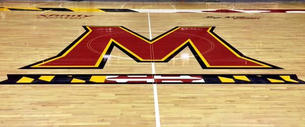
0:15-0:19 — Can it be? Why, yes, it is! Sound the alarms, we have our first major court adjustment: Out with the “Maryland” that had been written across center court, and in with that bold and beautiful “M.” And it’s a change I wholeheartedly support. That “M” is without a doubt the coolest logo this university has in its repertoire. Sure, the “Maryland” is awesome looking too, but let me put it this way: The “M” is the 22 Jump Street of Maryland logos, while the “Maryland” is the 21 Jump Street — both classics, but one is still superior.
0:20-0:26 — There it is: The new court in all its glory. The feelings I’m feeling as I first lay eyes on the new design are similar to how I felt when I first saw a high-definition TV — I knew my life was going to change, I just wasn’t sure how yet. I mean, look at that court. Really look at it. The sidelines are practically dripping in state pride. The new center court is fresher than a breath mint. It was time for an upgrade.
0:27-0:31 — I didn’t even know that the scary, creepy-eyes version of Testudo made an appearance here the first time around because I was still in shock from the previous six seconds.
By the name of Kevin Anderson, that was a well-executed unveiling. Seeing Mark Turgeon and Brenda Frese’s teams compete on the new floor this season is going to be tremendous fun. If the quality of play matches the quality of court, we’re in for a magical year.

Gary Williams Court at Xfinity Center

