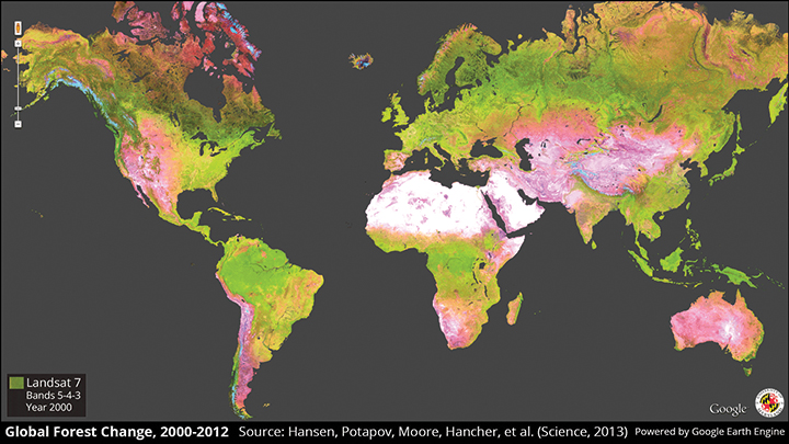

Detailed forest mapping allows scientists to better understand deforestation patterns across the globe. University scientists created this high-resolution map from 650,000 satellite images, to track changes from 2000 to 2012.
Researchers from this university released the first high-resolution map of worldwide forest gain and loss last week, the result of a collaborative effort with researchers from Google, the federal government and other universities.
The map, pieced together from more than 650,000 images taken by satellite, chronicles forest change from 2000 to 2012. The team reported a global gain of 800,000 square kilometers and a loss of 2.3 million square kilometers of forest over that period.
Matthew Hansen, team leader and geographical sciences professor at this university, said that while researchers did not receive funding for the project until 2011, the practice of map-building was far from foreign to his colleagues.
“We’ve been doing global land monitoring for about 20 years,” he said. “This was a natural evolution of our map.”
Hansen said he started talking to collaborators from Google Earth Engine, a database that offers users access to an extensive knowledge of the Earth’s surface, four years ago. The Google team then implemented models developed at this university for characterizing the satellite image data and helped to quantify the map. This map is the most extensive of its kind to date, Hansen said.
“Nobody’s ever done a global assessment of [forest] loss and gain at this scale,” he said.
Wide-ranging map coverage brings some obstacles, however. Occasionally, pattern recognition misidentifies terrain such as a swamp as a forest, Hansen said.
Creating the perfect map is not yet possible, said Peter Potapov, a geographical sciences research professor who worked on the team. He and Hansen said they have received both positive feedback and criticism from researchers in places as far away as Africa and Asia.
“We’re taking in feedback and striving to improve our map,” Potapov said. “We know the percentage of our error.”
Many countries do not have the information the map has collected, Hansen said. Others, such as Australia and India, conduct similar studies of forest change at least once every year but release little data to the public, if any, he added.
The country that exhibited the greatest reduction in forest loss was Brazil, which also releases a forest change study annually.
Because these studies from different ends of the world operate under different presumptions, Hansen said, the global forest change map does not borrow from previously collected information.
“We don’t rely on national, regional or anyone else’s data,” he said. “Not every country defines trees, forests or loggers the exact same way.”
Researchers plan to update their global map yearly, but they’ll have to adjust their models for a new satellite that was launched into orbit earlier this year.
“We haven’t formulated how we’re going to do it, but we want to reassess every year,” Hansen said.
Among the surprising trends in the study was that the tropics had the greatest increase in deforestation of any climate on the map during the analyzed time period. Additionally, Indonesia had previously reported that its rate of loss was declining, but Hansen’s team found the opposite was true.
Hansen said he hopes the research will push countries to improve both policy and transparency about forest increases and decreases. He and Potapov agreed, however, that the most important attribute was that the map is free from political and moral agendas.
“Everybody will use it,” Potapov said. “If you’re an environmentalist, you can use it. If you’re a logger, you can use it. There are so many uses that we don’t even know where it will end up.”