I’ve never been a super organized person. Sometimes I feel like I’m at my best when I’m on the verge of disaster. So when I started seeing everyone redesign their iPhone home screens, I didn’t think it was for me. But some Pinterest-loving part of me wanted to give it a shot. Is the long and exhausting journey of customization worth the hype? Would my life feel more put together with a color-coordinated home screen? I had to learn for myself.
The new iOS 14 update allows you to add widgets to your home screen, and people are now using Apple Shortcuts and Widgetsmith to completely customize their iPhone home screens. It’s exciting to finally have some customization for an iPhone; this update allows you to make your phone truly yours. And many people have done exactly that, posting their aesthetically pleasing layouts on Twitter and TikTok.
I would not suggest doing this unless you have a lot of patience. You also get sucked in pretty quickly, so make sure you have some time to spare before you begin. It helps to have a visual eye, but if you don’t know exactly what direction you want to go in, there are tons of examples on social media. For example, I recently saw a Club Penguin-themed layout on TikTok. The options are endless.
[Here are the most eccentric Crocs collaborations out there]
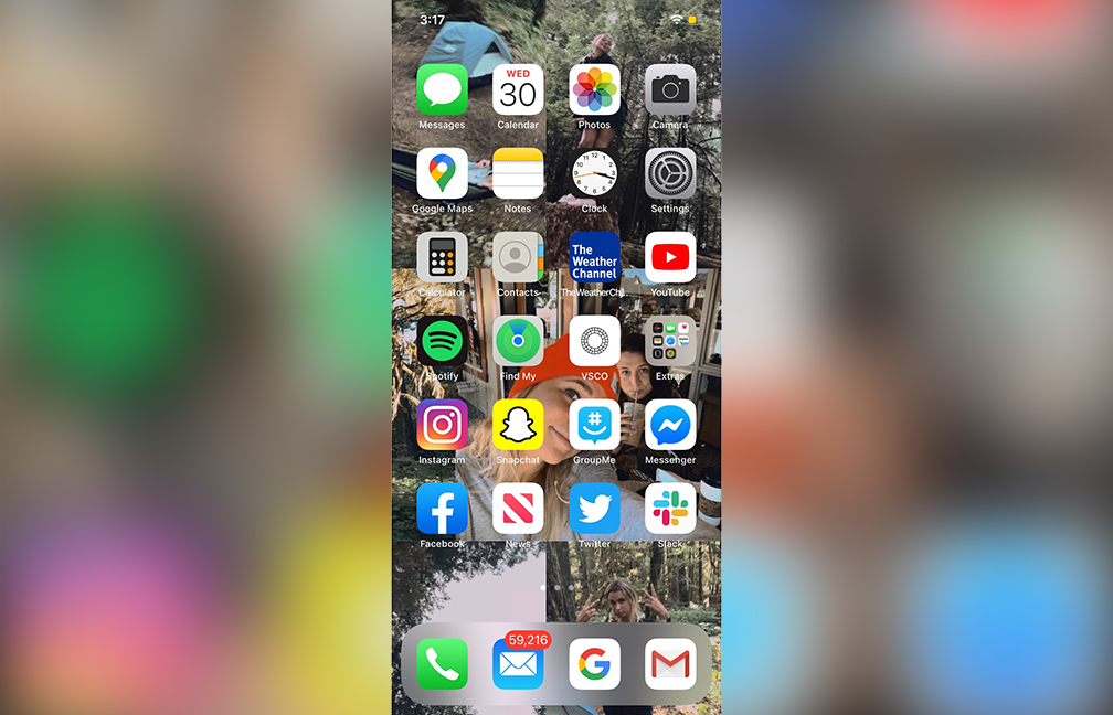
This is my before home screen. I had three pages of apps: no organization, no rhyme, no reason. And I was happy with that. It was all I knew. Chaotic? Yes. But I knew where every app was located like the back of my hand, so I was nervous to switch it up. Change isn’t easy. But, new update or not, I knew it was time for a refresh. (Ignore my obnoxiously high number of emails.)
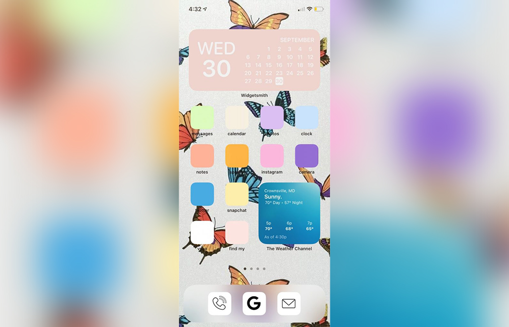
My first attempt at customizing my home screen was kind of a fail. I didn’t know what I wanted my theme or aesthetic to be, so I just started playing with colors. I saw people online replacing the app icons with a block of color — but although it was pretty, it wasn’t practical for me. I’m used to clicking on each app by its icon, and I hated having to read the tiny text to see what each app was. Version one was cute, but not functional.
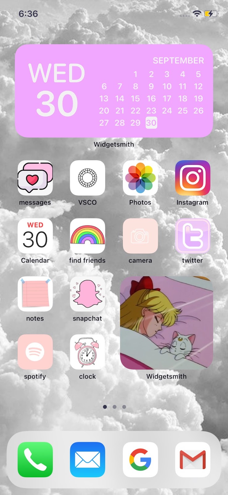
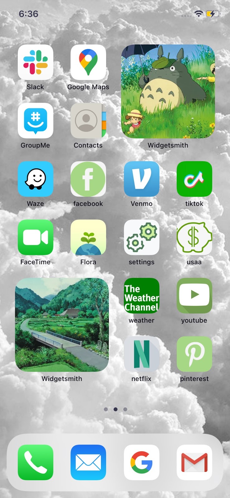
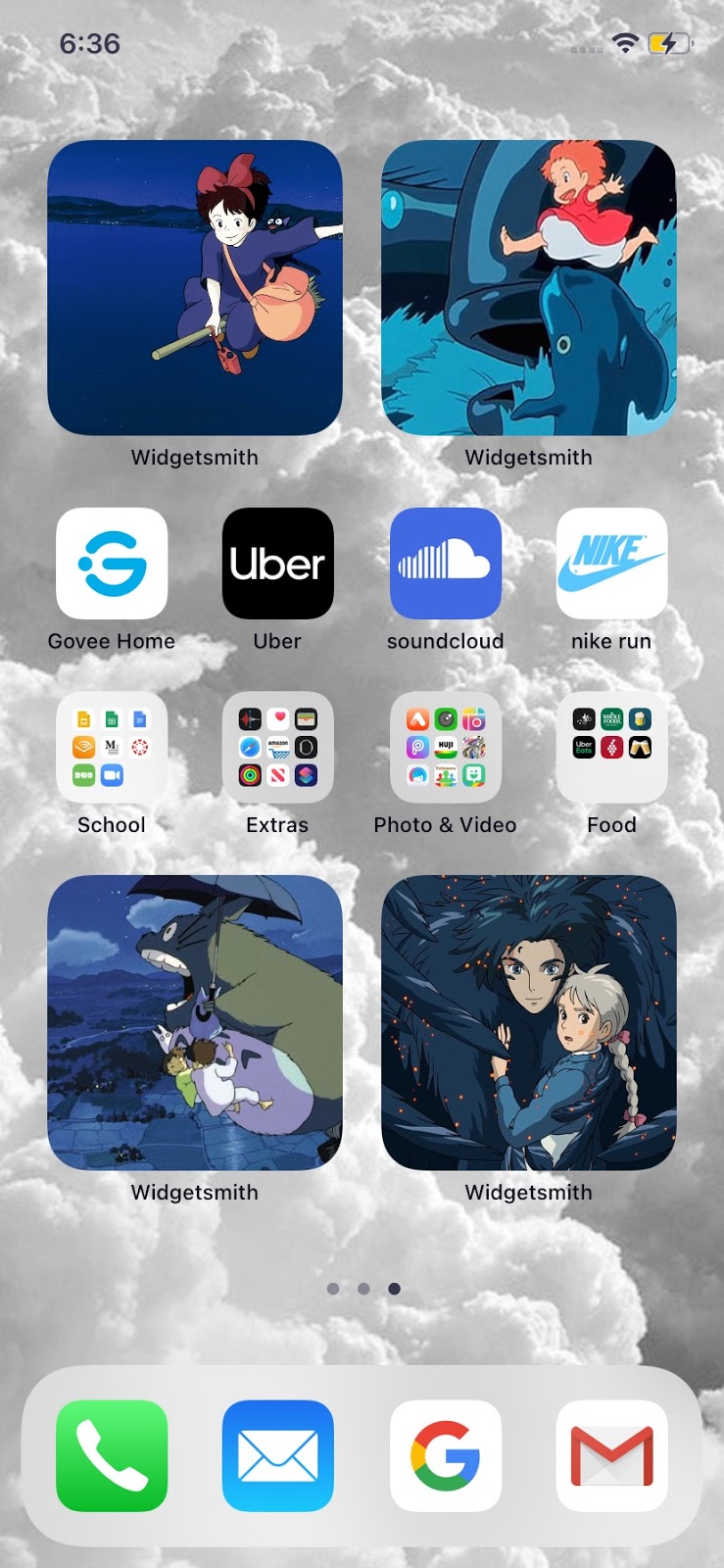
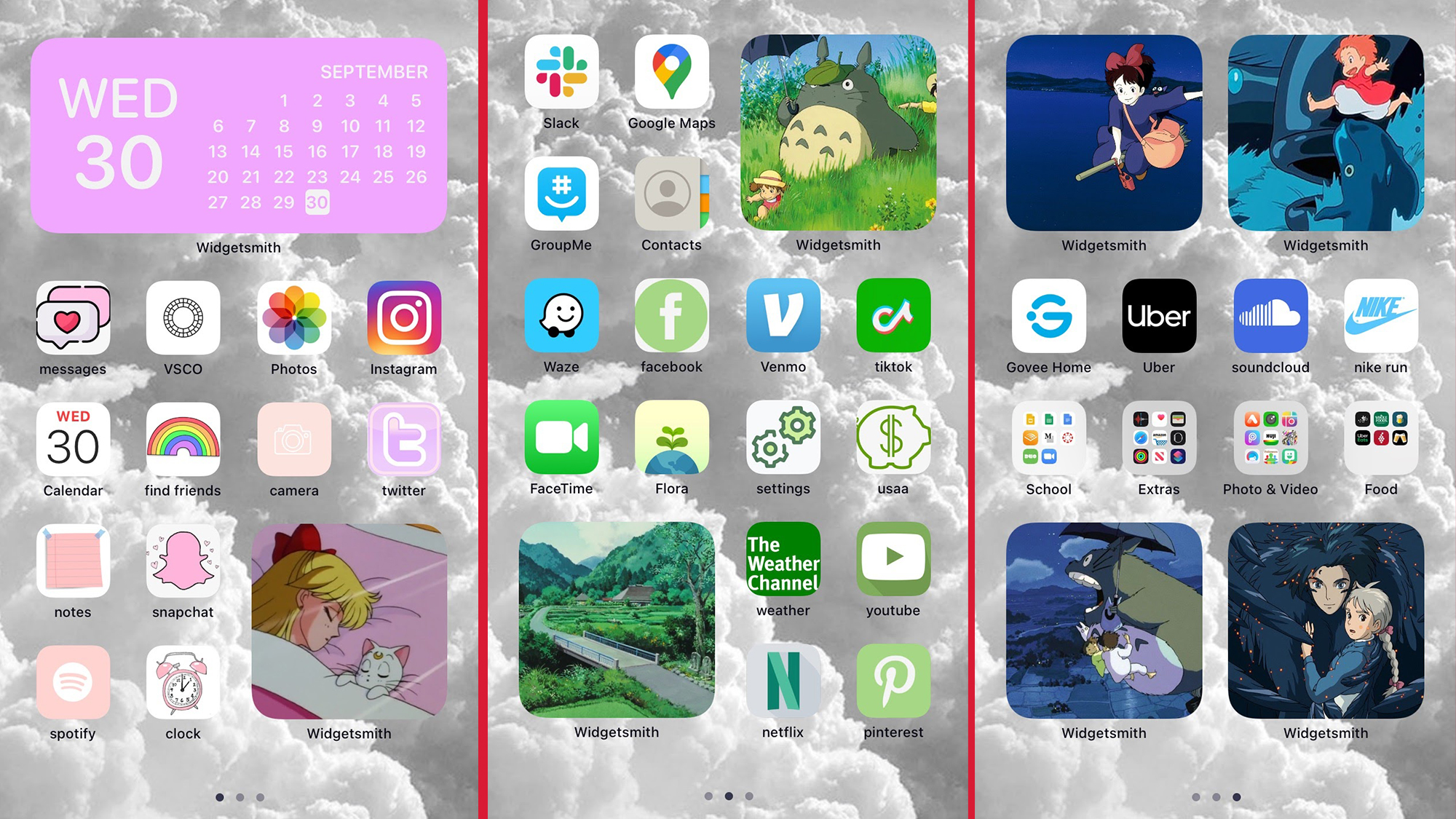
Once I got the hang of it, I decided I wanted to color coordinate each page, but make each icon similar to its original icon so I could easily identify them. In the Widgetsmiths (the big squares), I put pictures from my favorite movies. The most time-consuming part was finding an image for each app and manually changing it. It was exhausting, yet strangely addicting.
[Three standout shows from a pandemic fashion week]
Now that I’ve spent some time with my new home screen, I do like it. Looking at it brings me joy. It fulfills my artistic eye. The only annoying part is that when you open an app you created, it brings you to the Shortcuts app first and then to the actual app. It only does this for a second, but it does take some getting used to.
Overall, customizing my iPhone pushed me to do some much needed decluttering. Now, my phone layout is a lot less overwhelming to look at. However, the best part about this was being able to exert control over something. Even though it’s an inconsequential iPhone screen, it was unbelievably therapeutic to zone out and make something pretty.
The final result: